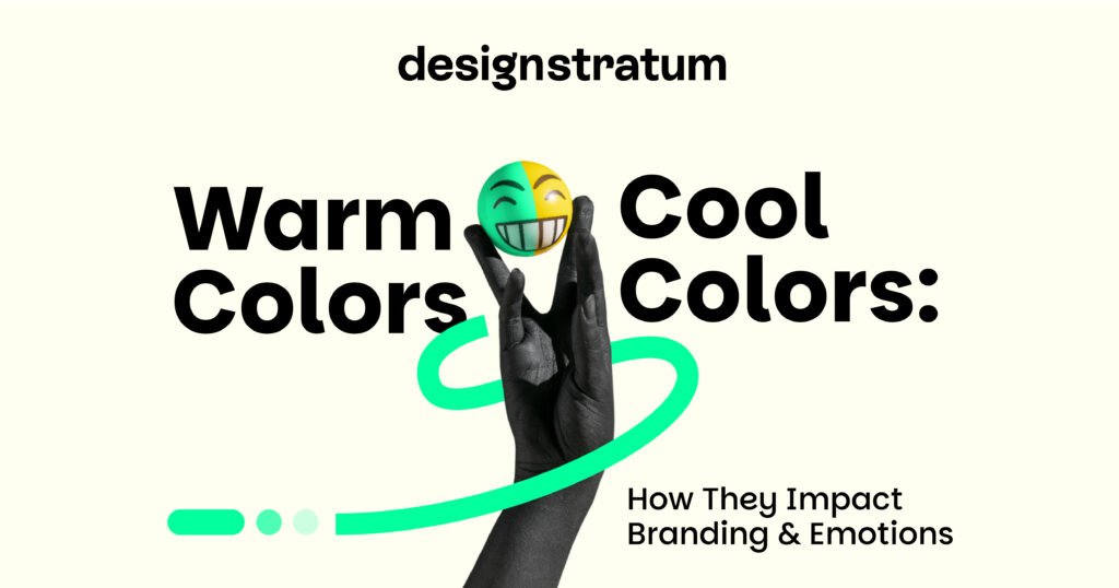
Warm Colors vs Cool Colors: How They Impact Branding & Emotions
Have you ever wondered why so many banks use blue in their logos, or why fast-food chains lean on red and yellow? That’s not a coincidence. Color is one of the strongest non-verbal cues in branding. Before a single word is read, colors set the tone, spark emotions, and even shape trust.
This article is all about colors and how they impact branding and emotions, because 62-90% of first impressions are based on color alone. We’ll look at warm vs cool colors. What they are. The color psychology behind them. And lastly how they influence branding decisions.
So by the end of this blog, you won’t be going alone, you’ll walk out with a clear picture of how to choose the right color palette for your own brand.
Table of Contents
- What Are Warm and Cool Colors?
- The Psychology of Warm Colors in Branding
- Why Warm Colors Work (When Used Right)
- The Psychology of Cool Colors in Branding
- Warm Colors vs Cool Colors: Which Works Best in Branding?
- Choosing the Right Color Palette for Your Brand
- FAQs on Color Psychology in Branding
- Conclusion
What Are Warm and Cool Colors?
When you look at the color wheel, you’ll notice that designers divide it into two halves:
( add a color wheel picture)
This division does not only involve the appearance of colors adjacent to each other, but also the touch and the feelings they produce in human beings.
Warm colors: reds, oranges and yellows. Fire, sunlight, and energy are the colors of these colors. Warm tones in branding are usually related to urgency, excitement and positivity. They provoke action and this is why you will find them in those industries where it is important to capture attention fast like food, sporting and retail industries.
Cool colors: purple, green and blue. These tints are associated with water, forests and shade. Cool colors produce a sense of peace, trust, and imagination. You will now understand how often cool colors such as blues and greens are commonly used in brands in finance, healthcare, and technology! No, the reason is they aid in assuring the customers and developing credibility.
So, what are the cool colors and warm colors in branding? Warm tones are designed to stand out, spark emotions, and create momentum, while cool tones focus on stability, relaxation, and long-term trust.
If you’ve ever wondered what colors are warm and cool, here’s the quick breakdown:
- Warm = red, orange, yellow.
- Cool = blue, green, purple.
And if you’ve come across terms like cool vs warm colors or cool tones vs warm tones, they’re simply different ways of describing this same division.
Now, let’s learn a little more about cool toned colors and warm toned colors.
The Psychology of Warm Colors in Branding
Always the warm side of the color palette is the loudest when we speak of warm colors and cool colors. It is these colors that are attention grabbing, emotion arousing, and action oriented. But what do the cool colors and the warm colors in branding are, you may be wondering, think about it this way: warm colors are the extroverts, and cool tones are the introverts. The warm tones scream, the cool tones comfort.
- Red: Passion and Urgency
The color red attracts attention in an emotional context. It raises energy levels, creates urgency, and even stimulates appetite. That’s why Coca-Cola, Netflix, and YouTube lean heavily on it. They want to be remembered instantly, and red delivers that boldness.
(picture of top brands with RED LOGO )
- Orange: Friendly Energy
Orange sits between red and yellow, giving us the best of both worlds. It’s energetic but not aggressive. Playful but still approachable.
Examples? Fanta and SoundCloud. They use orange to stand out, while Amazon’s orange “smile” adds friendliness to its branding.
- Yellow: Optimism and Accessibility
Yellow is the “smile” of the color palette. It’s bright, cheerful, and tied to feelings of optimism. McDonald’s golden arches, IKEA’s bold yellow, and Snapchat’s playful branding all use yellow to feel fun and accessible.
Why Warm Colors Work (When Used Right)
Warm tones are action-oriented in the discussion of cool vs warm colors. They are effective in the areas of the industry where you would like to ignite quick decision-making processes: food, entertainment, retail, and sports. And excessive heat may flood. Here the warm and cool tones make up each other. The potential of mixing warm colors with cool colors or neutral does not make the branding dull, as there is always the possibility of winning a customer.
What are the warm and cool colors in branding? Warm = red, orange, yellow. Cool = blue, green, purple. It is not which side to pick, but which side to use when and how to use it to fit the personality of your brand.
That is what we do at Design Stratum, to get businesses that balance. Warm colors will make your brand exciting and memorable, whereas chilly colors will bring back the order and be trusted in the long term. It is the combination that will render a brand exciting and reliable.
The Psychology of Cool Colors in Branding
Cool colors are linked with trust, reassurance, and calmness. They make people feel safe, stable, and inspired, which is why industries that rely on credibility—like finance, healthcare, and tech—use them extensively.
Blue is the classic trust-builder. It conveys reliability and professionalism, making it a favorite of IBM, Facebook, and PayPal. Even smaller businesses use blue to signal stability and reduce uncertainty.
Green represents health, growth, and eco-consciousness. Whole Foods uses it to emphasize natural qualities, while Spotify leans on green to highlight creativity and progress. It’s also the go-to choice for brands that want to project sustainability and balance.
Purple blends creativity with luxury. Cadbury uses it to express indulgence, while Twitch taps into its imaginative and visionary side.
Overall, cool colors excel at industries where trust, security, and long-term relationships matter most—building dependable, lasting connections with customers.
Warm Colors vs Cool Colors: Which Works Best in Branding?
The short answer is: it depends on your brand’s goals.
Warm colors are great for industries where energy and excitement are the drivers. That’s why fast food, sports, and entertainment brands lean heavily on them.
Cool colors make sense when reliability and calmness are more important. Finance, healthcare, and SaaS companies often take this route.
The right choice comes down to your audience. If your customers are making quick decisions and you need urgency, warm colors can help. If your customers are making thoughtful decisions where trust matters, cool colors might be better.
Infographic idea for readers:
Warm vs Cool Colors → Emotions + Brand Examples (visual summary).
Choosing the Right Color Palette for Your Brand
Picking brand colors isn’t about what looks “pretty.” It’s about alignment.
- Define your values: Are you about excitement, or are you about security?
- Map emotions to colors: Trust may call for blue, while creativity could point to orange or purple.
- Test your palette: Check how the colors look together, how they appear on screens versus print, and how they fit with your typography and visuals.
A well-chosen color palette doesn’t just make a logo look nice. It becomes part of the customer’s memory. When someone sees a shade of red, they think of Coca-Cola. When they see a deep purple, they think of Cadbury. That’s the power of consistency.
At Design Stratum, we guide startups and growing businesses through this process to make sure their brand colors aren’t just attractive, but also meaningful and strategic.
FAQs on Color Psychology in Branding
What is the triad of colors in branding?
A triad refers to three colors evenly spaced on the color wheel. They create a balanced but dynamic palette that works well for brands that want variety without losing harmony.
Which colors convert best in marketing?
It depends on context. Red is often linked to urgency, which is why it’s used for sale signs. Blue builds trust, so it’s strong for call-to-action buttons in SaaS or finance.
Do cultural differences affect color psychology?
Yes. For example, white is linked to purity in Western cultures but is used for mourning in some Asian traditions. It’s always important to consider your audience’s background when selecting colors.
Conclusion
There are both warm and cool colors that are weighty in branding. Warm colours instigate energy and urgency whereas cool colours instigate confidence and composure. The correct decision should be made depending on your customer body and how you wish them to feel when they look at your brand.
You do not need to solve it by yourself in case you are not sure which direction to choose. At Design Stratum we assist businesses to create brand identities that have a color palette that aligns with their values and appeal to the audience.
Ready to choose colors that make people remember your brand? Let’s talk.